← All workBranding / MedicalInviora
A med spa identity carried through brand and digital design applications.
01 / THE PROJECT
Branding & Digital design.
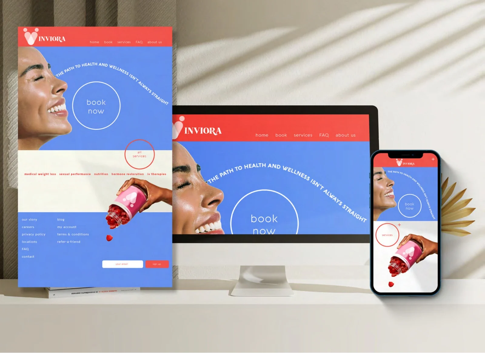
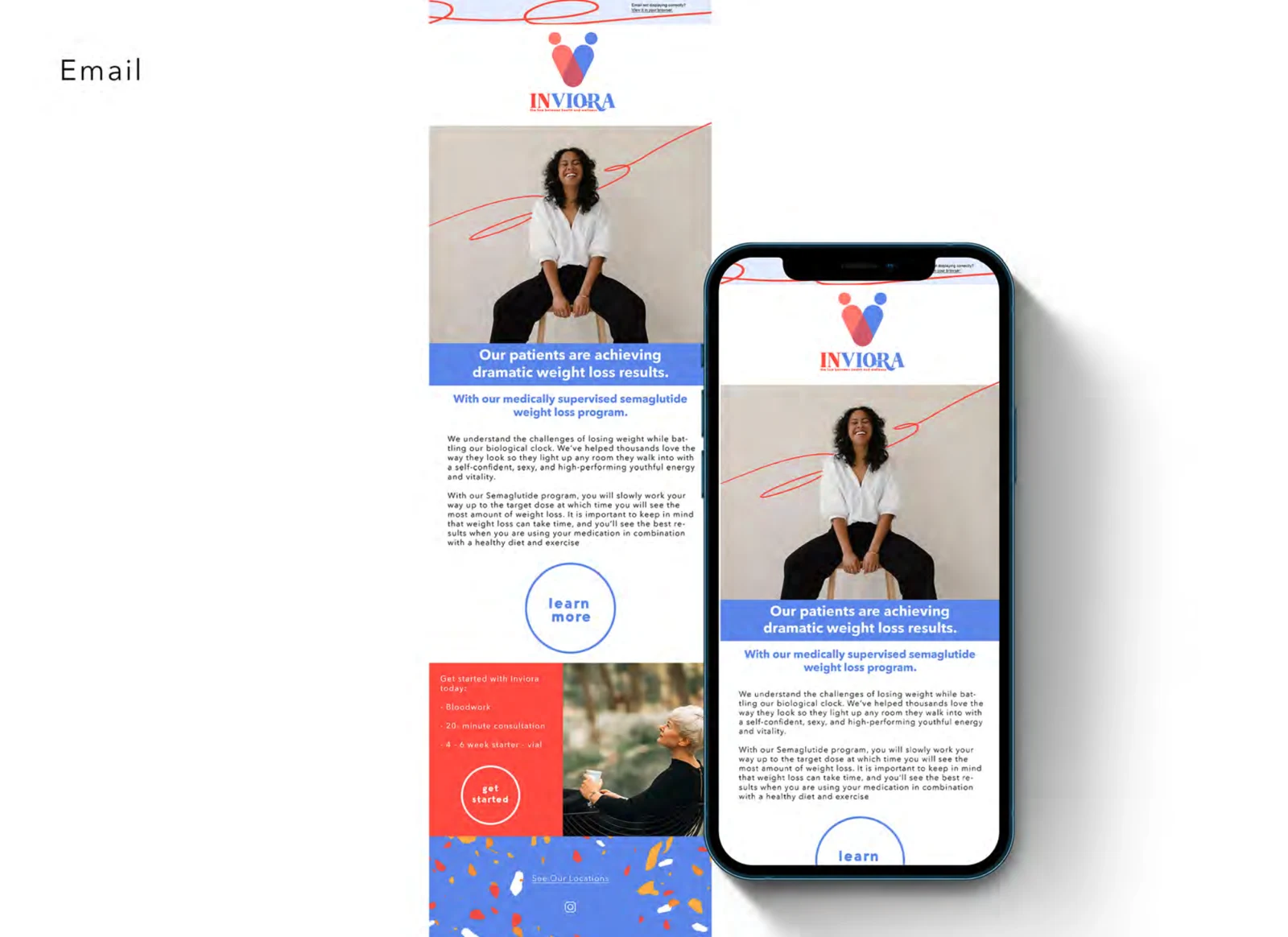
A healthcare and med spa identity carried through print, web layouts, email, outdoor mockups and physical-environment concepts. The project gives each application a shared visual language, with enough range for a large poster, a mobile screen or a more detailed service message.
The identity introduces care with a recognizable visual language across the places someone may encounter the brand. Applications in print, digital layouts and the physical environment show how the mark, palette and patterns work together.
WHAT I WORKED ON- Visual identity
- Brand applications
- Digital design
- Website mockups
- Email application
- Environment concepts
/01Build a recognizable visual system
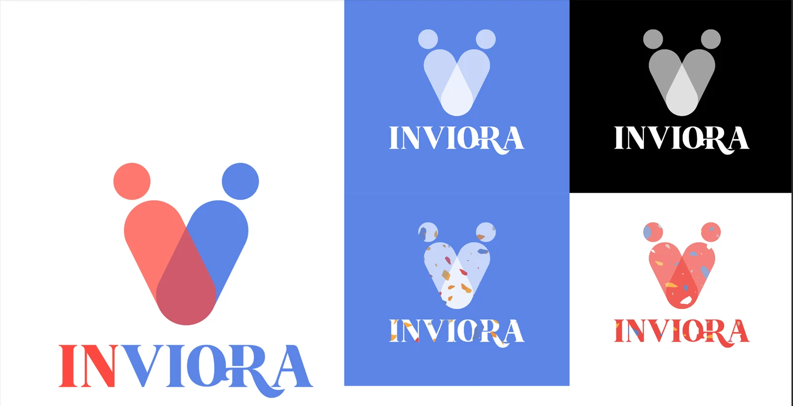
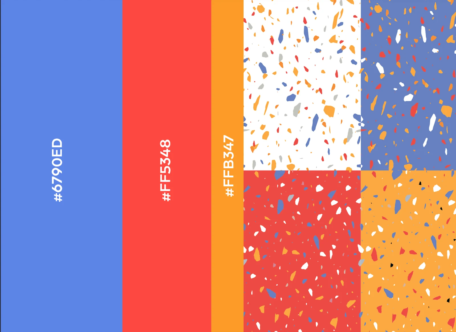
A joined, two-color mark anchors the identity. Blue, coral and warm yellow appear alongside a repeatable pattern treatment, giving different applications shared cues even when the photography or message changes.
/02Test the identity across formats
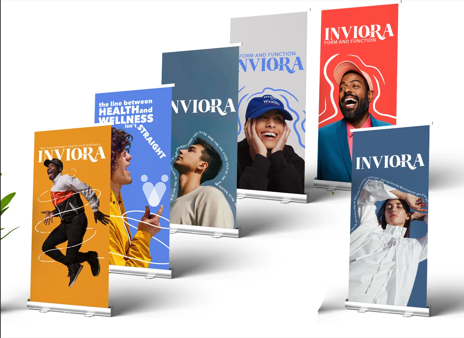
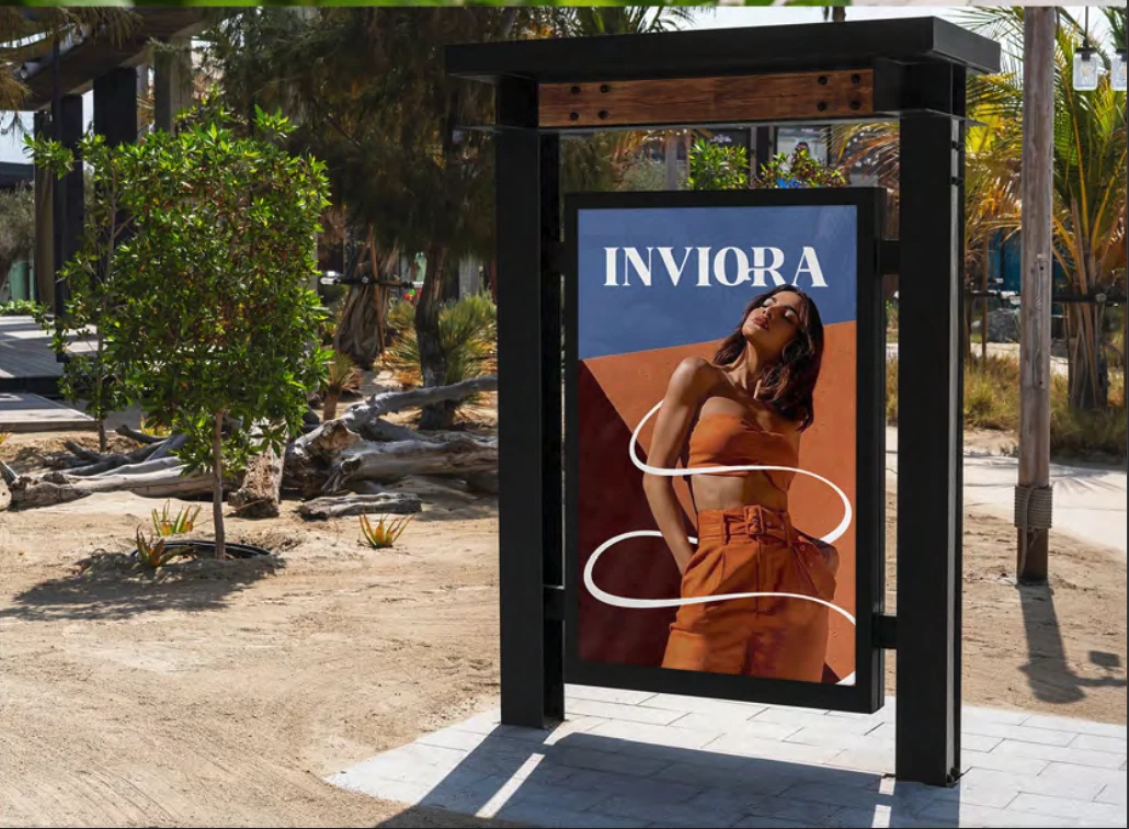
The identity appears in poster series, banner stands and outdoor display mockups. These design studies show how the system handles large images, short messages and distance viewing while preserving its color and mark.
/03Bring the system onto the screen
Desktop and mobile website mockups and an email application carry the same visual language into digital touchpoints. Interior concept boards extend the exercise into the setting where the brand would be experienced.